A BEM syntax with UX in mind
At some point, while working on the MontageJS framework, the question came up what CSS naming convention we should start using. After a long discussion we settled on using the BEM methodology, but changed the syntax a bit. To keep this post short, I won’t go into detail why using BEM is a good idea, but rather explain why we chose a different syntax. Here some examples:
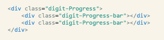
.digit-Progress          /* org-Component */
.digit-Progress-bar      /* org-Component-childElement */
.digit-Progress--small   /* org-Component--variation */
Note: The
org-(digit-) prefix is used as a name-space so it wouldn’t conflict with other packages/libraries/frameworks.
Now let’s take a look at the reasons for choosing such a syntax.
Hyphens (-)
The main reason why we’re using a hyphen (-) instead of underscores (_), has to do with the fact that their behavior is different when double-clicking to select text. Try for yourself:
component__element /* underscores */
component-element  /* hyphen */
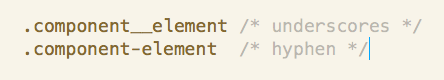
See how when you’re using underscores it selects the part before and after, in this case the whole component__element. But with hyphens it let’s you select only the part you double-clicked. component OR element. This let’s you quickly edit only the parts you want:
camelCase
Now, what if the component or child element consists of multiple words? We could use underscores like component_name-element_name. It would still be double-clickable, but readability suffers since it’s harder to see what belongs together. Better to use camelCase which groups each part visually: componentName-elementName.
MainComponent
OK, I think we’re getting closer. As a last rule, for the “main” component we use PascalCase. The reason for it is to add emphasis and make it easier to distinguish the main component from a child element. Also when using a namespace, the component moves to the second position, which makes it even more important to have it stick out: org-Component-childElement
–variation
We kept the more commonly used double hyphens (–) for variations. digit-Progress--small. It makes sense, because it pulls the variation (–small) visually more apart and makes it look like it’s something “different” than the default component.
So that’s about it. For more details about this naming convention, take a look at the SUIT framework, which also started to use the same syntax and documented it really well.
In the end, whatever Shade of BEM you choose to cook with probably depends on your personal taste, but thinking about a great UX by improving usability and readability won’t hurt either.
Edit this page, leave feedback or send a Tweet.