Nesting Components
The struggles with contextual styling
Using CSS components is somewhat straightforward. We add the markup and give it the component’s class name and all is good. Where it gets trickier is when we try to nest components. And when they need to be tweaked based on the context. Where should the styles be defined? It’s a question I’ve been asking myself a few times and what this article is trying to explore.
Just to clarify before we start, with “CSS components”, I mean the small building blocks that get used to assemble a website or app. Like buttons, inputs, navs, headers etc. Some also call them modules or patterns. Also I’m using the SUIT naming convention in the examples below, but any other convention would be fine as well. And just a heads, there isn’t some awesome solution at the end that solves all the problems. It’s just me whining most of the time.
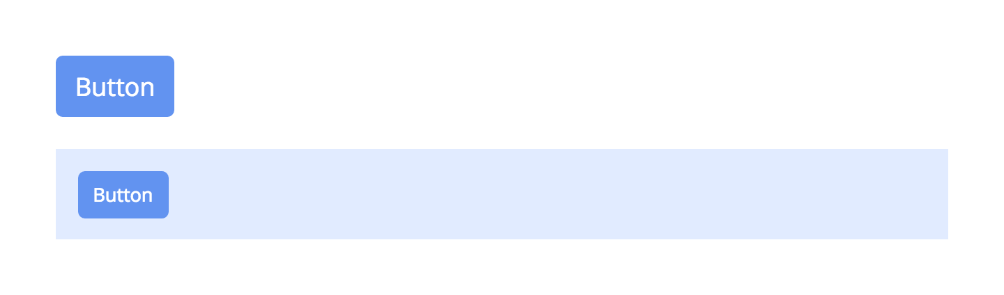
Ok, best is to go straight into it and look at an example. Let’s say we have a Header component where we would like to add a Button component inside.
<header class=“Header”>
  <button class=“Button”>Button</button>
</header>
Now because the Button is inside the Header, we want to make the Button a bit smaller than it would be on its own.
Here a few approaches how to do that:
Option 1 - Descendant selector
Maybe the most common way is to use a descendant selector to change the font-size whenever a Button is inside a Header.
.Header .Button {
  font-size: .75em;
}
This works great but the question is, where should this rule be added? We probably split our components into separate files, so is it in header.scss or in button.scss? In other words, should the Header know about what other components might get nested or should the Button know in what environment it will get placed?
But wait, the point of creating components is to separate them, make them modular. Each component should be kept isolated and shouldn’t know about other components. So we can make changes, rename or remove them without having to check if they might get used somewhere else.
Option 2 - Variations
Another way is to create variations. We add a .Button--small class that we can use whenever we would like the button to be smaller without having to worry about ancestors.
.Button--small {
  font-size: .75em;
}
<header class=“Header”>
  <button class=“Button Button--small”>Button</button>
</header>
This works great too, but could get out of hand quickly. What do you do if at some point you want the font-size to be .9em? Create yet another variation? Button--justALittleSmaller. As the project keeps growing, the number of variations will too. We will start to loose sight where they actually get used and we’re not sure anymore if we can change a variation or if it will have side effects in some other place. We could create “contextual” variations like Button--header or Button--footer, but then we’re back at the beginning and could just as well use “descendant selectors”.
Same goes for using states. .Button.is-small should only be used if there is a change in state and not to fit a certain context.
Option 3 - Adopted Child
I can’t remember where I read about this approach but somehow it stuck with me. I also forgot how it was called. So for now I’ll just call it “Adopted Child”.
Let’s switch it around and look at it from the Header’s perspective. What would we do if we wouldn’t know what the components are called that might get nested? But we know that we want to make them a bit smaller. Well, we probably would create a generic .Header-item class and use it like this:
.Header-item {
  font-size: .75em;
}
<header class=“Header”>
  <div class=“Header-item”></div>
</header>
Ok, that gets us a bit closer. Now, it’s probably strange saying it like that when talking about CSS, but what would we do if we don’t want to create an own child, but still have one. Right, we could adopt one. In our example we adopt a Button component as our own child. We didn’t create it, but now we can tweak.. erm.. I mean “raise” it like it’s our own:
// born in button.scss
.Button {
  font-size: 1em;
}

// raised in header.css
.Header .Header-item {
  font-size: .75em;
}
<header class=“Header”>
  <button class=“Header-item Button”>Button</button>
</header>
It is a bit uncommon that the same HTML element shares classes from two different components. And it’s not without any risks. More about them later. But I really like this approach because it keeps the components independent without having to know about each other.
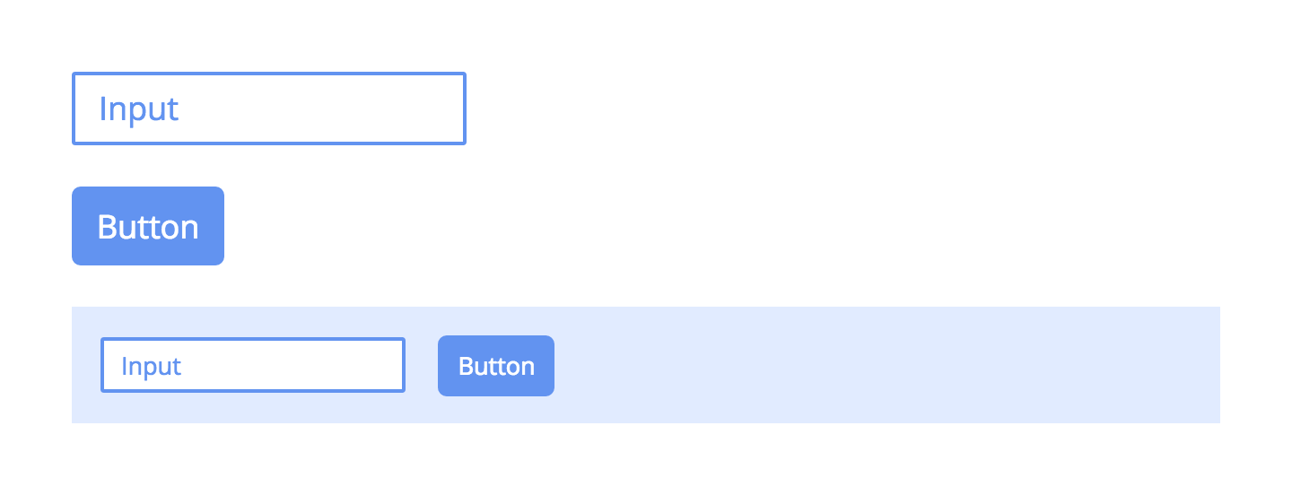
Another nice thing is that if we want to add other components to the Header that also need the same adjustments, we can reuse the same Header-item class, like for example on a text Input.
<header class=“Header”>
	<input class=“Header-item Input”>
  <button class=“Header-item Button”>Button</button>
</header>
Ok, about those risks. Well, depending on what properties we wanna change, it might not always be ideal. For example, because the Button already had font-size defined, we had to increase specificity by using .Header .Header-item. But that would also override variations like .Button--small. That might be how we want it, but there are also situations where we’d like the variation to always be “stronger”. An example would be when changing colors. When the color of Buttons should be different inside a Header, but not when its a variation, like .Button—primary. Yeah, we could take a look inside button.scss or our style-guide, but remember our goal.. we actually don’t want to make decisions by looking how other components are made.
So, as a general rule, don’t use “adopted children” for any properties that are theme related and only where you can be sure that you want to override them all the time. Like for layout/size related properties or adjusting the position.
More options?
There are some more ways to do contextual styling that came to mind. I’ll just mention them briefly for completeness, but think the 3 above are better suited.
Option 4 - We could use a preprocessor to extend an existing component. In our example it would be a clone of the Button with some tweaks added and used as a new child component .Header-button. Now we only rely that the Button exists in the source, but don’t have to worry about other contexts. Downside is inflating our CSS output. As well as having to remember lots of new child component classes.
Option 5 - We could create a utility class like .u-small. It’s similar to variations, but not scoped to a single component and could be used for other components as well. And for that reason it becomes very risky to ever change later.
Option 6 - And of course, we could use inline styles. But I would leave that to JavaScript only.
So after all that, which is best? I’m afraid there isn’t a clear winner. It would be nice to keep it consistent with a single approach throughout the entire project, but I guess we just have to decide on a per case basis:
- Descendant selectors if we can expect that components don’t change much. Like when using a UI Kit or library.
- Variations if it makes sense that a component has different versions that get reused anyways, and not just for a specific context.
- Adopted Child for layout, sizing, positioning or where we are sure to always want to override a property. Also for changing multiple child components at once.
- Extending when we truly want the components to be separated and don’t mind inflating the CSS output.
- Utilities for very specific things, that once the class is defined, it will never change, like clearing floats.
- Inline styles if it needs to be dynamically added with JavaScript.
As said at the beginning, I haven’t found a “fits all” solution and maybe the conclusion is: Try to keep contextual styling to a minimum.
Updates
The “Adopted Child” approach is called “Mixes” in BEM. Here some more infos.
SUIT also recommends using “Adopted Child/Mixes”. But also another option:
Option 7 - Adding a wrapper element. It’s the <div class="Excerpt-wrapButton"> in that example. I think it works great in most cases. But for example when using Flexbox, because it has this parent/child relationship, adding an extra wrapper in between would break it. And then you might still need to set the width of the wrapped component to 100% or so. Anyways, this is a great addition. Thanks Pablo in the comments.
Option 8 - Single Purpose Classes. It’s where every class has only a single property. It’s somewhere between utilities (Option 5) and inline styles (Option 6). Atomic CSS and Tachyons use this approach. I haven’t used them on a real project, but just from looking at it, the concerns are similar to the ones from utilities. If you want to change the value in a SP class, it seems unpredictable. Because in another place (where that same class is used), you might want to keep the current value. So you would have to first check if the change has any unwanted effects somewhere else.
Edit this page, leave feedback or send a Tweet.