Filtering (photo) filters
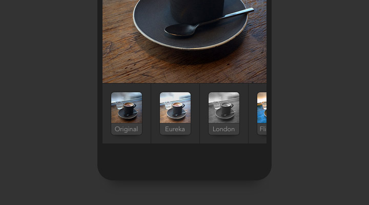
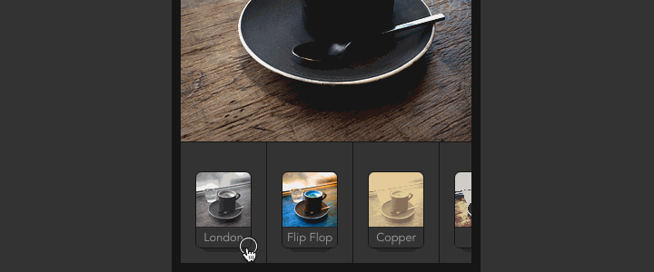
A lot of photo apps allow you to add filters before sharing. The typical UI for picking a filter is a row of little thumbnails that can be horizontally scrolled. I’m sure you’ve used it many times. It looks something like this:
The problem
A filter picker like that is easy to understand and works pretty well. But in my case, there is something that has been bugging me a bit. Here is how I use it:
- I start with the first thumbnail and then just keep tapping one after the other.
- If there is a filter that I like, I try to remember its name. And somewhat its position, but more like “somewhere at the beginning”.
- Then once I reach the end, I start scrolling back trying to find the ones I liked.
- Usually there are like 2-3 filters that I would like to quickly compare before making my final choice. But it’s quite hard to scroll between them, especially if they are far apart. Also having to remember their name/position costs some precious brain power.
Now, I don’t really know how most people use these filter pickers. Could be that:
- Most people just stop once they found a filter they kinda like and don’t bother trying the rest.
- Or some have a few favorites and know their name/position already.
- You could also just look at the little thumbnails. But some filters are very similar and I need to see them on the actual photo to judge.
Possible solutions
So I was thinking about some possible improvements:
1. Order by popularity
Automatically order the filters based on how often they get used. This makes filters that you use most appear at the beginning and are easier to get to. You could always keep scrolling in case you’re in the mood for something new. This would of course mess it up for people that have filters remembered by position. But not sure how many actually do that.
2. Manual re-order
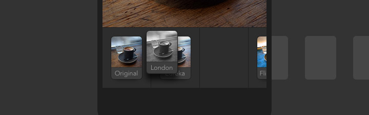
Let people manually reorder the position. Could be done similar like the home screen icons on iOS (long press until they wiggle, then drag around). I would probably move my favorites to the front and also sort based on color/style.
3. Narrow down
Let people temporarily toss away the filters they don’t want. This would allow you to narrow down your selection to just a few for easier comparison. Of course, all the filters would be back next time you take a new photo.
Or probably even better (3B): Instead of throwing away the ones you don’t like (could be tedious if there are a lot of filters), you could push up only the ones you like and they would move to the right with a visual separator. It’s similar how you can pin a Chrome browser tab to separate it from the rest. Then once you scrolled to the end, you would have all your previously selected filters next to each other, waiting to be the lucky winner.
Conclusion
I understand that the suggestions might make a photo app more complicated and harder to explain to a new user. But it could be more a “power user” feature that you’re not forced to use if you don’t want to. Anyways, in case I’m not the only one with this (small) problem, I hope some day we will have a better way to filter filters. Ohh.. and let me know if you’re already using an app that tackles this somehow.
Update
Thanks for all the comments. Good to see more people thinking about this. I played around a bit more with the demo, mostly after the conversation with Ignacio in the comments below. So here a 4th option:
4. Select and cycle
Let people select a couple filters and then cycle through them by tapping on the photo. It’s actually similar to 3B, but it keeps the UI simple by using the photo as the secondary navigation control. Here the steps how to use:
- You can tab each filter until you find one you like.
- If you tab a 2nd time on that filter, it gets selected as a “favorite”. It will move up a little to visualize it.
- You can keep trying other filters and mark more as favorites.
- Once you reached the end (or think you have enough), you can tap on the photo above the filter picker to quickly cycle through all your previously selected (favorited) filters. Now comparing different filters is really quick and easy.
Try the demo.
The implementation of the demo could still be improved. It is a bit hard to discover that you can tap the photo to cycle through your favorites. Might need some visual clue to help understand it better. Adding swipe gestures instead of tapping would also improve UX. Or to remove a filter from your favorite selection, you could just swipe down on the image. Also note that the filters are CSS based and still a bit glitchy when animating. But you should get the idea.
Update II
Manuel Haring explored a similar concept where you can push up filters to narrow down your selection.

Here a larger video that has even a third selection stage.
Edit this page, leave feedback or send a Tweet.