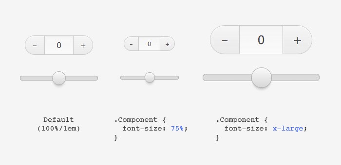
Sizing (Web) components
When using a CSS Framework, I think it’s quite important that you can easily customize it. You use a framework because you don’t want to reinvent the wheel, but you still want to give it a twist to make it your own. This is especially true on the Web where there isn’t really a “style guide” like on platforms like iOS or Android.
So when it comes to changing the size of a component, for example making a Slider bigger for touch input, it might get tedious fiddling with all the widths/heights, border-radi.. etc. So how can we make it easier? Well, by sneaking a Trojan horse into your components and use it to control all the size related CSS properties.

What Trojan horse? Good ol’ font-size, hooked up to EM based units.
Let’s take a look at an example: For every CSS property that has a direct impact on the component’s size, we use the em unit.
.Component {
    width: 5em;
    height: 2em;
    border-radius: .5em;
    border: 1px solid gold;
}
Note that the border is set to
1pxsince it should stay always like that, unrelated to size changes.
In some cases we need to override the font-size that comes from the UA style sheet. For example when we use a <button> or <input> element we can add a font-size of 100%, 1em or inherit to make it inherit from its parent. Or use something like normalize.css which already takes care of that.
.Button {
  font-size: inherit;
  …
  border-radius: .5em;
  border: 1px solid gold;
}
With that setup, the resizing can begin. Because EM’s are tightly coupled to the font-size, we now can change all the em units at once by just changing the font-size. This allows you to scale up/down a component and keep all the proportions intact.

Benefits
- Super easy and quick, no fiddling with width/heights. It even cascades down to a component’s sub-component.
- It keeps all proportions intact
- If you need to, you can still override width/height etc. as usual.
- You’re pretty flexible what to change. It could be on a global level
html {…}, the wrapper of multiple components like a.Header {…}or just a single.Component {…}. Or even inline in the markup. - It’s also great for setting the size programmatically. For example a user could change them in the settings.
Potential issues
- Since browsers try to snap to whole pixels when using EMs (to make lines look sharp), it could have some rounding errors so that it’s off by 1px. Not a big problem with larger sizes, but you might notice it when going really small. I found that when you stay with even px values, it should be ok. Mostly happens with odd values.
- Wrapping your head around how font-size/em translates to the real width/height might not be that easy. For example if you set a component to a font-size of
20px, it doesn’t mean its height is also20px. So if you wanna change it to a specific size, you need to calculate it or just try it out.
FAQ
Here a few questions that came up.
Why not using REMs?
It works, but it’s somewhat limited. You only can change the root element (html) which might be ok in some cases. But with EMs you get finer control by changing any element individually. Or you can limit it to only certain parts of your App. For example only make all components bigger that are inside the toolbar.
Why not use a CSS preprocessor?
Good question. By using Sass/LESS/Stylus etc. you could nicely abstract the sizing and not be dependent on the font-size. But a simple answer: Maybe you can’t or won’t use a CSS preprocessor. Another and maybe the only real reason: As seen above in the benefits, you can change the font-size dynamically (while the App is running). And the size is not locked into a fixed unit when compiling with a CSS preprocessor.
Why not use transform: scale()?
That wouldn’t affect the surrounding and might overlap other elements that are nearby.
Feedback
I haven’t tested this in the wild, so I’m not sure how it will work out in practice. I guess this technique is quite old and has been used before, so if you have experiences with it, I’m curious if you ran into any other issues.
Update I
We’re now using this technique in the Digit UI set. Has been great so far.
I also took a quick look at some of the other CSS frameworks out there:
- Pure uses
em’s with default font-size of100%. - Foundation uses
em’s with default font-size of1em. - SUIT uses
em’s with default font-size ofinherit. - Topcoat uses
rem’s with default font-size inpx. - Bootstrap uses
px’s everywhere. - Ionic uses
px’s everywhere.
So as far as easier resizing goes, I like how Pure, Foundation and SUIT are doing it.
Update II
Originally I used a default font-size of 16px in the example. But some people pointed out it’s better to just let it inherit from its parent. Initially I was concerned about that and wanted to make the size consistent no matter where you drop a component. But on a second thought, I think they are right. So I changed the post to reflect that.
Interestingly, Pure uses 100% and Foundation 1em and SUIT inherit. Anyone know if there is any difference? Just a matter of taste? I think I prefer inherit, so that’s what I used in the example above.
Update III
On the same topic, Jeremy wrote a good post called Confused About REM and EM? One thing that he suggests is using __REM__s for margin/padding. That way the spacing stays the same when changing the size of components. I quite like that idea and might gonna try out how that works.
Edit this page, leave feedback or send a Tweet.