Styling with STRINGS
At this year’s CSSConf in Melbourne (AU) I gave a talk called “Styling with STRINGS”. The talk is about how we can use Flexbox, currentColor and __EM__s inside components to quickly style entire Web Apps straight in the browser.
In case of tl:dw here some of the main points:
Layout
When creating mobile “App” layouts, where not the whole page is scrollable, but instead only certain parts. And you have anchored areas like header/footer and a main area that should fill out the available space, then the easiest way is to use Flexbox.
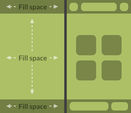
This lets you easily drag around components that are set as flex items and they always position nicely. Using flex: 1; on components makes them stretch out and fill the available space. A good use case is a search input or a title.
Color
If you don’t specify the border-color (initial value) it will be the same value as color.

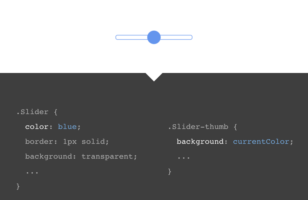
Furthermore there is a color value called currentColor. As the name indicates, it’s also mapped to the current color value. We can use it as background-color for example. Not that useful when the text should be readable, since now text and background are the same color, but for some components without text it can be quite useful. Like in the example below with the slider thumb.
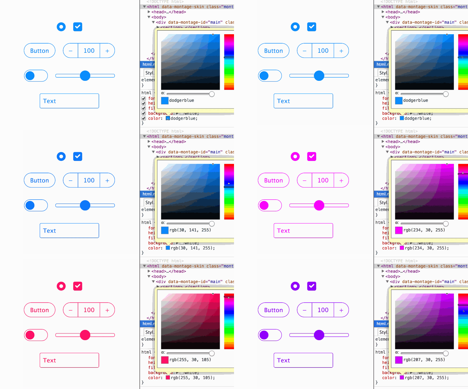
If a component set should look similar to the “iOS 7” style then currentColor works great. Below all components have no color values at all and only use currentColor. This let’s us change everything by only changing the color value in the root html element.
Size
In a similar way, EMs are mapped to font-size. So if we use EMs to define only the proportions of a component, we can use font-size to scale it up/down. And if we inherit the font-size we could also control everything at once with just a single property in the root or in groups if we go deeper down the DOM tree.
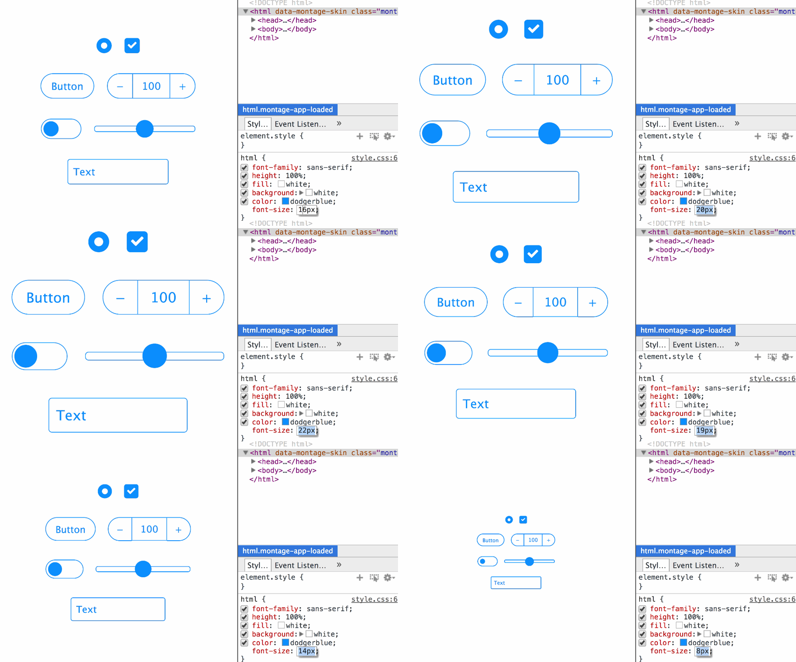
REMs work the same except that they are tied to the root html element only. We could use it to control the spacing of the components by using REMs for margin/padding.
I wrote about this in more detail in the Sizing (Web) Components post.
All together
Now if we combine this all and test it in an example application, we can easily design many variations right from the DevTools/inspector in a quick and easy way.
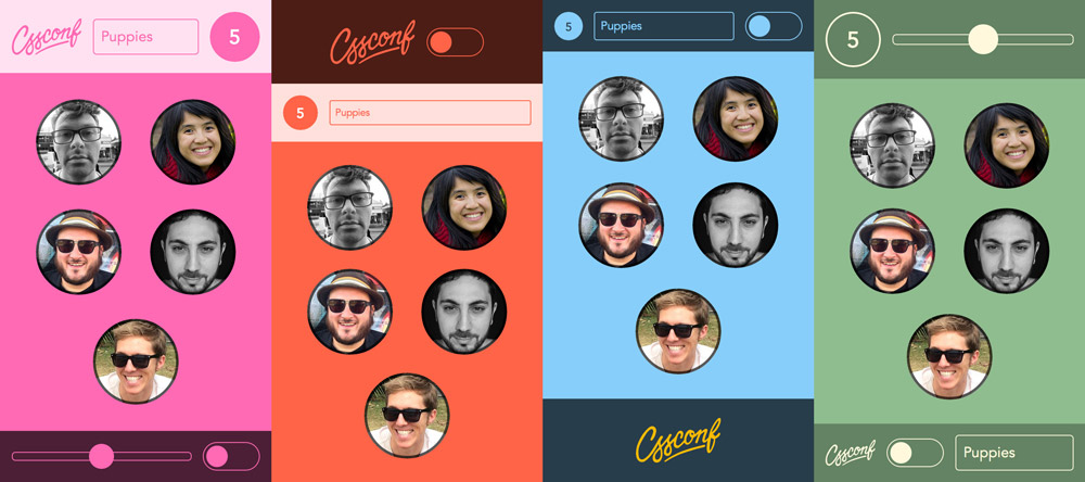
Feel free to play around with the CSSConf App yourself or check out the source on GitHub.
How to save?
You might wonder how you can save the changes made in the DevTools/inspector without having to manually copy them over into your CSS file. In Chrome there is a feature called Workspaces. It let’s you map a URL to a local folder. Once that is setup, all CSS changes will automatically be saved to your local disc. Here a post that explains how to setup Workspaces. It’s advised to use version control like Git, so that you can always discard all changes if you went too far and wanna start over.
Conclusion
Admittedly it is somewhat in between of being useful for production and just a “hack”. Especially the currentColor. But the main point of the talk is best told by this quote:
“Creators need an immediate connection” — Bret Victor
The examples I used are just the closest I could get using CSS alone and still keep code clean. I hope we keep that principle alive and improve on it.
ps. Artist of the puppet master illustration: Unknown.
pss. Here all the other videos from CSSConf.
Edit this page, leave feedback or send a Tweet.