Contextual styling with custom properties
How to have multiple themes on the same page
Something I’ve been wanting for a long time, define different regions like a footer section, or side bar and not have to deal with all the contextual styling hassle. A.k.a. “Now that this button is used on a dark background, the button needs to change its colors too. Where should the styles live?”. Here an old post about struggling with contextual styling.
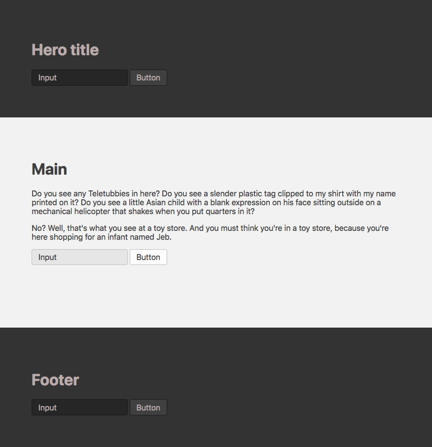
So then the other day I was doing some experiments with using custom properties for Atom’s UI. Turns out, using custom properties might make contextual styling a bit easier. For the rest of the post, let’s switch to a more simple example. A page where the main area is light, but then has a dark hero and footer section. Like this:

In the past, I probably would’ve created variations like Button--dark or overwrote it with header .Button {…}. Depends a bit on the project. Here another approach: Create themes with a set of variables, then apply the theme to the different areas.
1. Default theme
First let’s define our default theme with a bunch of variables.
[data-theme="default"] {
  --fg:         hsl(0,0%,25%);
  --border:     hsl(0,0%,75%);

  --bg:         hsl(0,0%,95%);
  --button-bg:  hsl(0,0%,99%);
  --input-bg:   hsl(0,0%,90%);
}
Then we create some components where we use the variables defined above.
[data-theme] {
  color: var(--fg);
  background-color: var(--bg);
}

.Button {
  color: var(--fg);
  border: 1px solid var(--border);
  background-color: var(--button-bg);
}

.Input {
  color: var(--fg);
  border: 1px solid var(--border);
  background-color: var(--input-bg);
}
And lastly we add the [data-theme="default"] attribute on the body so that our components will pick up the variables.
<body data-theme="default">
If you wonder why use data-theme attributes over classes? Well, no specific reason. Maybe with attributes, it’s a hint that only one theme should be used per element and is more separated from your other classes.
At this point we get this:
See the Pen Contextual styling with custom properties (1/3) by simurai (@simurai) on CodePen.
2. Dark theme
But our designer wants the hero and footer to be dark. Alright, let’s define another theme region.
[data-theme="dark"] {
  --fg:         hsl(0,10%,70%);
  --border:     hsl(0,10%,10%);

  --bg:         hsl(0,0%,20%);
  --button-bg:  hsl(0,0%,25%);
  --input-bg:   hsl(0,0%,15%);
}
And add the theme attribute to the header and footer.
<header data-theme="dark">
<footer data-theme="dark">
Which gives us this:
See the Pen Contextual styling with custom properties (2/3) by simurai (@simurai) on CodePen.
The reason why this works is that custom properties cascade and can be overridden on nested elements, just like normal properties.
3. Hero theme
A few months pass and our designer comes back with a redesigned hero section. “To make it look fresh” with a splash of color.
No problem! Just like with the dark theme, we define a new “hero” theme.
[data-theme="hero"] {
  --fg:         hsl(240,50%,90%);
  --border:     hsl(240,50%,10%);

  --bg:         hsl(240,33%,30%);
  --button-bg:  hsl(240,33%,40%);
  --input-bg:   hsl(240,33%,20%);
}
<header data-theme="hero">
And here is that fresh hero:
See the Pen Contextual styling with custom properties (3/3) by simurai (@simurai) on CodePen.
It’s also not limited to colors only, could be used for sizes, fonts or anything that makes sense to define as variables.
Benefits
Using these theme “regions” lets your components stay context un-aware and you can use them in multiple themes. Even on the same page.
- Developers can add components, move components around, without having to know about in what context (theme) they live. The markup for the components stays the same.
- Design systems authors can create new components without worrying about where they get used, the variables used in components stay the same.
- Designers can define new theme regions, or change existing ones, without having to make changes to a component’s HTML or CSS, it stays the same.
Less time to talk about who, how and where, more time to talk about the weather. ☔️🙃
Concerns
Yeah, right. The big question: But does it scale? Can this be used for all use cases.
Ok, I’m pretty sure it doesn’t fit all situations. There are just too many to find a single solution for them all. And I’m actually not sure how well it scales. I guess it works great in these simple demos, but I have yet to find a larger project to test it on. So if you have used (or plan to use) this approach, I’m curious to know how it went.
A concern I can imagine is that the list of variables might grow quickly if themes have totally different characteristics. Like not just a bit darker or lighter backgrounds. Then you might need to have foreground and border colors for each component (or group of components) and can’t just use the general --fg and --border variables. Naming these variables is probably the hardest part.
Update I
@giuseppegurgone made an interesting comment:
in suitcss projects I used to define component level custom props, theme variables and then create themes by mapping the former to the latter suitcss-toolkit
So if I understood it correctly, by mapping theme variables to component variables, you could avoid your theme variables from growing too much and you can decide for each component how to use these theme variables.
Update II
If it’s too early to use custom properties in your project, @szalonna posted an example how to do something similar in SCSS.
Edit this page, leave feedback or send a Tweet.